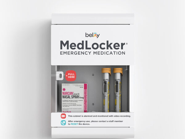
Belay is a digital health company committed to improving the lives of families who suffer from severe food allergies. The Belay app lets you easily communicate critical information about your child’s specific allergies, important allergy facts, and an emergency plan. From now on, your network of caregivers will always be informed and prepared to safely and confidently care for your child. Working with Belay founder, Abby Herzig and her team of experts, Adler Design led the creative teams and is responsible for the branding of the company. Check it out at www.webelay.com
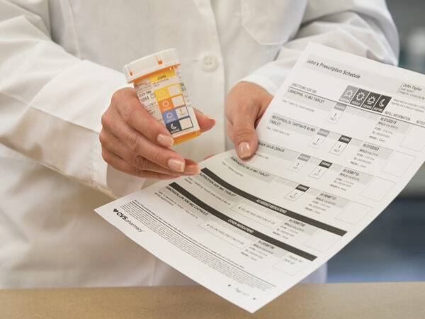
Adler’s latest pharmacy invention, AdlerRx, is a unique patented solution that’s focused on delivering a universal medication schedule to drive patient-centered care. This new system organizes your medications and looks across the time of day to create a schedule of sorts. People can clearly understand dosages and timing, even if they have trouble with literacy. CVS Health’s ScriptPath™ was our first client to leverage AdlerRx and is a strong example of how design can play a key role in improving clinical care. We worked with CVS brand standards to customize AdlerRx for CVS Health. Big bright icons make it easier for the user to get it right. The power of this simple idea is how it organizes action.

In an effort to boost member satisfaction and overall health, Adler worked with Medline and First Line Benefits to design and provide a series of kits to Healthcare plans. The Ready Set Kits tackle issues ranging from weight gain to COVID-19 prevention to fall prevention. The Pantry Kits help plan members prepare healthy meals, packed with delicious recipes and related pantry items needed to make good meal choices and pursue better health. These innovative program designs push health plans to the next level and simplify the path to better health.
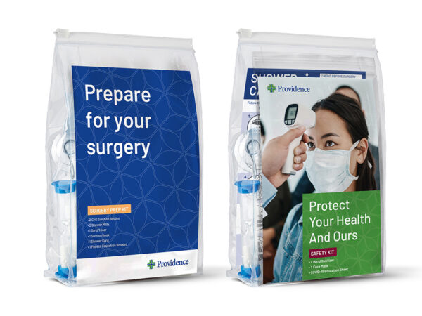
Surgical site infections (SSIs) are among the most common and expensive healthcare-associated infections in the U.S. — and the most preventable. Working with Medline, we designed a system that combines products and education to help standardize practice, drive patient compliance and lower the chance of hospital-acquired infections. Leveraging best practices for reducing the risk of SSIs, we also designed a three-step solution that includes kits for Pre-surgery, surgical closures, and patient discharge & recovery.
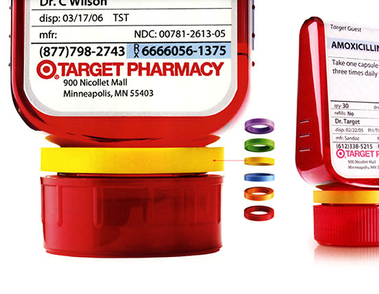
One day, Deborah’s grandmother took her grandfather’s medicine by mistake. Her name was Helen. His was Herman. Same initial – H Adler – and the pill bottles looked alike.
This incident resulted in the ClearRx System for Target. From the color coded rings to identify each family member to the intuitive and easy-to-read label, ClearRx is designed for people who take prescription medication.
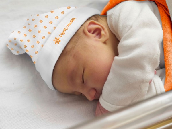
The recent rise of “consumerism” is changing the way health care systems are strategizing. Patients and families are now choosing where they want to receive care. In partnership with Dignity Health and Medline Industries, we discovered that empowering consumer choice requires a superior patient experience with branded touch points not just in the hospital, but across the entire continuum of care (ie. Physicians offices, Home Health, Long Term Care)
We created an entire new visual system for mom and baby, in addition to extending Dignity Healths brand guidelines into products and packaging that have the most patient impact.
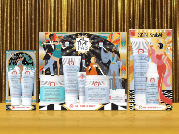
We have been working with First Aid Beauty since its inception in 2008. FAB founder Lilli Gordon enlisted us to develop an identity and brand packaging for her line of effective skincare essentials.
Working closely with her team on packaging, merchandising, web and print ever since, we have watched her brand grow for four blockbuster years at Sephora.
Our goal was to couple clear and important information with the brand’s “rescue and preserve” spirit. We created an iconic system buoyed by a life preserver logo.
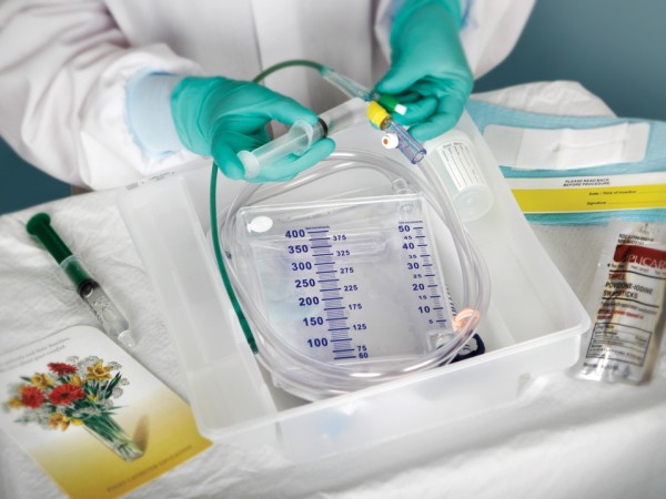
Catheter Associated Urinary Tract Infections (CAUTI) are the number one hospital acquired infections. Our goal was to reduce CAUTI by creating a calm and sterile experience for both caregiver and patient. We designed a one-layer system that simplifies the steps and keeps the catheter from going wild. A stop & check protocol is part of the label so it’s not missed. We transformed patient education from something forbidding into something welcome, a Hallmark-type card that nurses give to patients. Now, there are not only fewer infections but nurses and patients feel a lot better about the experience itself.

To further emphasize FAB’s brand positioning we have created a series of in-store displays. Featuring themed and branded end-caps, shelf strips, shelf talkers as well as free-standing displays.